도장 Logo Design
I designed a modern identity mark rooted in the tradition of Korean dojang stamps to carry my Korean name and American name together in a form I could actually use.

Overview
I wanted to design a personal identity mark that reflects both sides of my background—my Korean heritage and my life as a Korean-American designer. Inspired by traditional Korean signature stamps (dojang), I explored how to merge my English name and Korean name into a single, cohesive symbol that represents my cultural duality as well as my design sensibilities.

Goal
I wanted to create a logo that expressed my bicultural identity: echoing the visual characteristics of traditional dojang seals while also maintaining a minimal, geometric feel. The end design could be applied across my portfolio and other personal materials.
Context + Inspiration
During a trip to Korea, I visited shops selling traditional Korean signature stamps called dojang. Dojang, typically carved in stone or wood, use bold, geometric forms and deep red ink to create a striking personal imprint. They're meant to replace handwritten signatures, carrying both identity and authority in a single mark. I had my own dojang made with my Korean name, but without paper documents to stamp, I admired it from its shelf. I started wondering: what if I could reinterpret that tradition as something I could actually use, such as a digital logo that held the same weight and meaning? I came home with that question, along with photos from the stamp shops and my own dojang. These became anchor points for the visual and conceptual direction of the project.
Process
Exploratory Sketches
I began with low-fidelity sketches, abstracting the letters of my English name, and incorporating elements of the characters of my Korean name.
I explored dozens of configurations, guiding myself with constraints found in dojang design: compact geometric shapes and negative space. My goal was to reduce both names to their most essential shapes, looking for visual intersections that felt meaningfully connected.
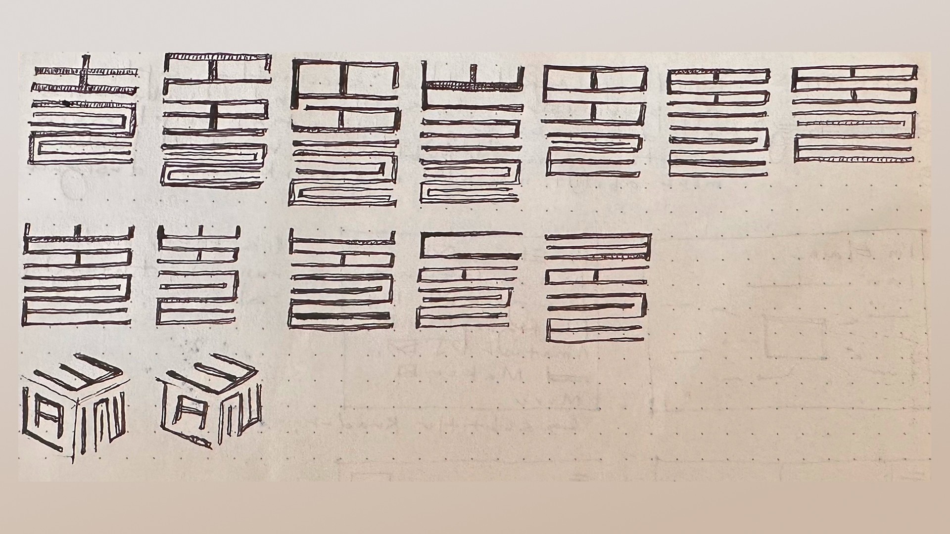
Digitization in Figma
I brought the selected sketch into Figma for vector refinement.
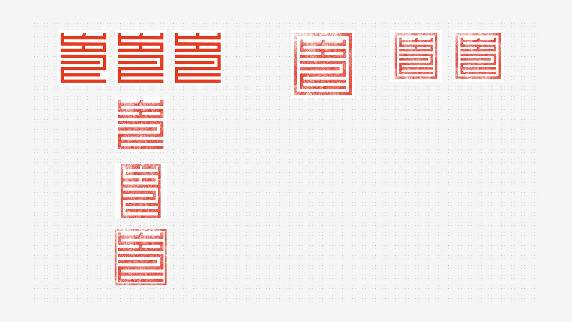
I chose to maintain the classic deep red used in traditional Korean stamps. To honor the physicality of hand-stamped seals, I added a subtle texture overlay to emulate the natural irregularities from ink spreading.
Final Product
In my final product, I merged the letters of my Korean name (최성인) and English name (Elaine). Looking back, I also marvel at how much the form reminds me of the MUNI logo; as a Bay Area native, another facet of my identity subconsciously integrated into the work.

Reflection
This project started as an intentional exploration of my bicultural identity as a Korean American, but somewhere in the process something unexpected happened: the final form began to resemble the SF MUNI logo. I didn't recognize it at first, but when I turned it on its side, I immediately saw it. As a Bay Area native, MUNI is part of the landscape I grew up in, and without meaning to, I'd let another piece of myself show up in the work. It reminded me how much our personal experiences shape what we create, even when we're not conscious of it. Here, it happened intentionally with my Korean and American names. But it also happened unintentionally with the visual language of the city that's been part of my life for years. As designers, we bring ourselves into everything we make: our backgrounds, the influences that shape us, the systems we occupy. This project taught me to pay attention to both: to design with intention, but to stay curious about what else might be coming through.

